You’ve been designing web apps for years, and you’re a total pro at it. Well done!
Now you have to design your first native app and you’re not quite sure where to start. Don’t worry. The good thing is most of your web design knowledge is transferable, but there are a few things you should keep in mind.
Respect Platform Conventions
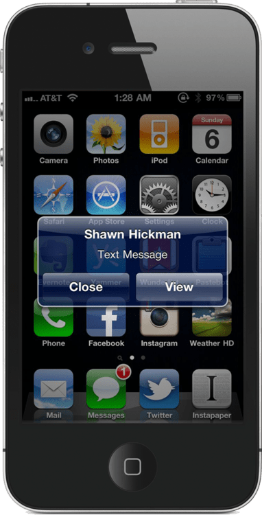
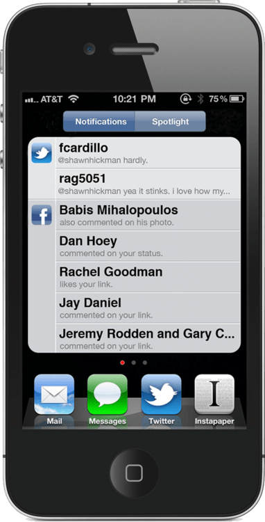
Understanding the environment you’re designing for is fundamental. What are the patterns and interactions users expect? If you design an iOS or Android app using only web design patterns, people will be frustrated.
The best way to understand platform conventions is to use that platform for an extended period of time. If you’re an iPhone user, try using an Android for a few months, and vice versa. Don’t let the Apple vs Google holy wars get in the way of doing great design work.
I’m aware that it’s not always feasible to acquire a second device, so here are a few other options for learning more about a software platform:
Performance Matters
This is not to say that performance doesn’t matter with web apps, but people’s expectations are different. On native platforms, people expect fast loading, smooth scrolling, and an overall snappy feel.
Your design decisions affect performance in positive and negative ways. Work closely with your development team to make sure your design doesn’t compromise performance. If it does, change your design.
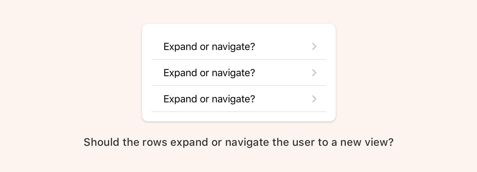
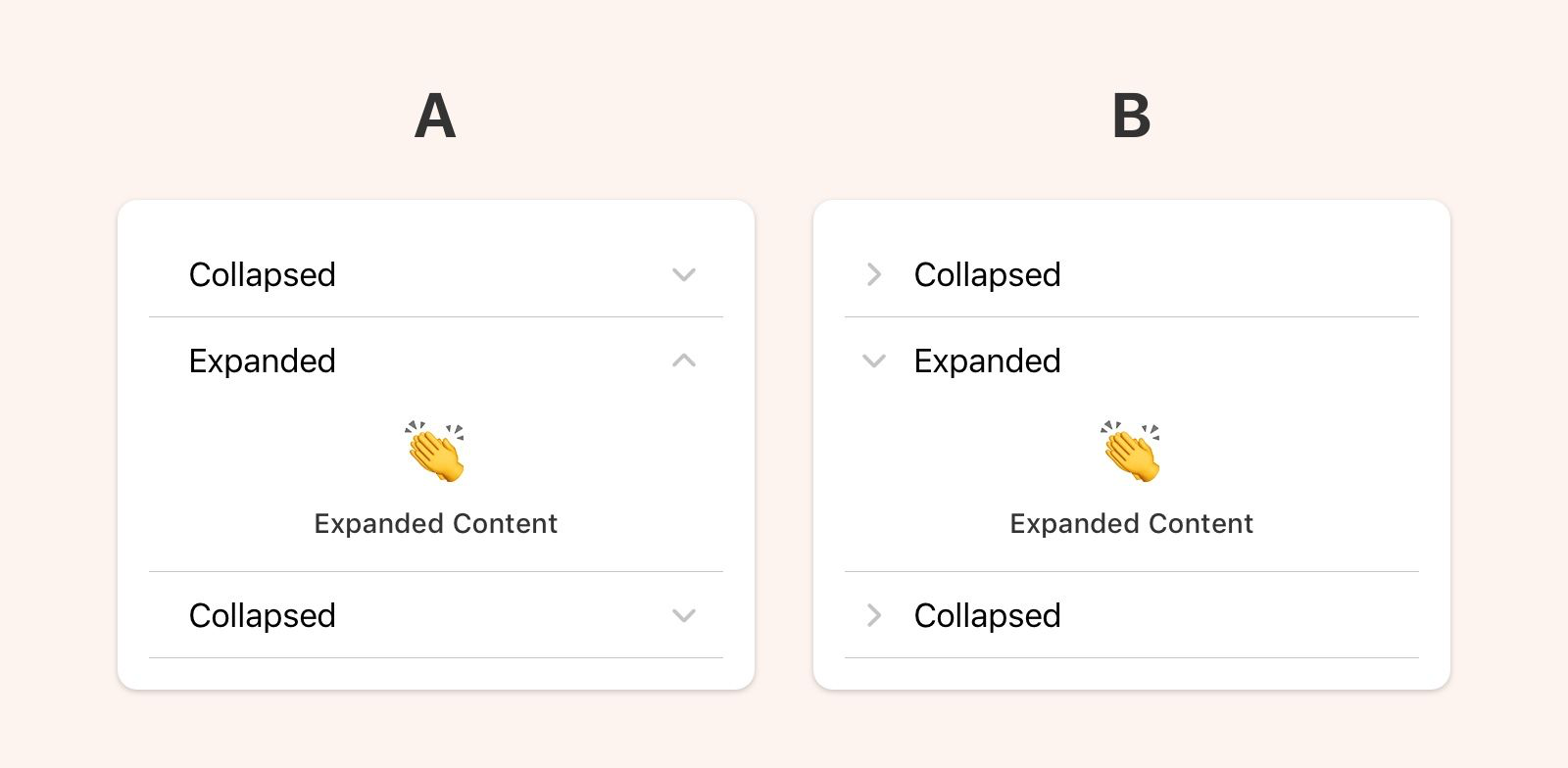
Your UI doesn’t have to be the same for every platform
Over the past few years, the design community has latched on to the idea that an app must look and function exactly the same for every single platform its on. The reason sounds something like this:
“If the UI is the same on every platform then our customers can easily jump from web, to iOS, to Android and not have to re-learn anything. This is a better user experience.”
The statement above is true if people only use your app. Sorry to break it to you but your app is probably not the center of people’s lives. That would be nice 😜.
Your app lives in the larger context of someone’s life. They are not thinking about your app as much as you are. They use it when needed and then move on.
In reality, people view their phones as a single experience. They may jump from app to app, but the way they see it they are just “using their phone”. Your app should fit nicely into that experience. Anything you do out of the ordinary will be noticed, and that’s not always good.
I think it’s more user-focused to use native patterns because it takes into account the totality of the user’s phone experience. They’ll understand the navigation structure because it’s similar to most of the other apps they use. They’ll know they can swipe to go back because every other app on their phone behaves the same way.
Not every app needs to, or should, surprise and delight. Most of the time people just want stuff that’s reliable and works well.
In Summary
Designing native apps is so much fun. Each platform has unique and powerful capabilities that are not available to web designers. Enjoy the experience of learning something new and don’t forget:
Go forth and design great native apps!