Filtering by tag: #posts ✕ Clear
Avatar
Shawn Hickman Feb 15, 2025

I’m excited to announce something new…I’ve started a new podcast called “Worklog”!

It’s where I share my journey of building Sofa into a successful indie app business—covering lessons, challenges, and insights along the way.

This is basically the stuff I make for YouTube, but in podcast-form.

You can get all the details and subscribe here:

I have six episodes published, which are repurposed YouTube videos that are already out. You’re going to hear me say “in this video…” in this first episodes, because I wasn’t thinking about the podcast yet lol. Going forward, I’ll do better.

I have a few reasons for launching this podcast, but the main two are:

  1. I’m building a podcast player into Sofa and I want to understand the full process/ecosystem of creating and listening to podcasts. No better way than to create my own.

  2. I want to broaden my reach with the stuff I share and talk about. While I love YouTube, there are many folks who would prefer to just listen to my videos instead of watching them. This is an effort to allow people to enjoy the stuff I make in a format they prefer.

Also, thank you to Stephen Robles for helping with some logistical/technical issues I was working through. I was struggling lol.

You can subscribe to Worklog in your favorite podcast player…and sometime soon in Sofa:

Avatar
Shawn Hickman Sep 22, 2023

I did a little experiment over the past week to post a Reel, TikTok, and YouTube Short every day. I wanted to see if I could manage and keep up with a daily posting schedule.

The results?

I hated it.

It tanked my focus and added a lot more stress to my week. For me, it’s not worth the trade-offs of my time, energy, and focus to post that often.

I'll be sticking with my weekly YouTube video and once-ish per week on other socials. That gives me the time I need to be heads-down working.

Also, this was the first time I really used Reels and TikTok. I understand why people love it, but personally it gave me a headache. Everything is so fast and chaotic. I prefer a much calmer experience when I'm trying to relax lol.

I have to think about how much I want/need to contribute to that chaos.

Avatar
Shawn Hickman May 7, 2023

This was a href="https://www.reddit.com/r/EVERGOODS/comments/13bardo/packing_comparison_for_the_cpl24_and_ctb26/">

I just got my CTB26 last week, and since I recently took a weekend trip to Chicago I thought it might be helpful for people to see how I packed things out in my CPL24.

For context, I only brought the CPL24 on the trip. I normally travel with a backpack and wheeled suitcase (carry-on), but wanted to keep things light for this trip.

What I packed for a 3 day trip to Chicago

Things I packed:

Evergoods CPL24

The pictures show what I packed and how it all fit, but here’s some strong>

Evergoods CTB26

I haven’t actually used the CTB26 yet, but here’s some first impressions:

I’m likely going to be selling the CPL24 since I don’t see myself using both. The CTB26 seems like a hit to me. Gives me the same great experience of the CPL24, but a little more space a functionality for travel (which was my main use for the CPL24).

Avatar
Shawn Hickman Feb 10, 2023

Notion is creeping into my life more and more, and one helpful little database I made is to track my PTO and the number of days I’ve taken or plan to take. I know the company tracks this, but checking Notion is much faster for me.

Here’s the formula to use to calculate the number of days off. It accounts for weekends and week days. I got it from this post.

Avatar
Shawn Hickman Mar 12, 2021

In software, consistency and cohesion tend to get lumped together as the same thing. I’ve found this leads to painfully tedious arguments around product and design decisions.

strong>

For example, in an app, a primary button may always be blue. This consistency is good. It communicates to people that anytime they see a blue button, an important action is about to take place.

strong>

For example, let’s use an onboarding flow for a person using a product for the first time. The combination of front-end UI, backend infrastructure, workflows, product strategy, marketing, and customer support working well together creates a cohesive experience. If any one of these parts is inconsistent, it takes away from the cohesion of the experience.

Consistency enables a cohesive experience, but consistency alone is not enough. Aim for cohesion.

Avatar
Shawn Hickman Dec 31, 2020

Read

Watched

Played

Listened to

Avatar
Shawn Hickman Jun 28, 2020

For the past year or so this site has been running on  a href="https://www.gatsbyjs.org/">

The process ended up being too tedious for what I’m looking for so I moved to WordPress.

I’ll break the Gatsby experience down into two parts: building and publishing.

Building

Building with Gatsby was, and is, awesome. Once I got my head wrapped around GraphQL I was able to really get things moving. Also, hot reloading and Sass FTW.

Publishing

This is where the experience fell down for me. Writing in markdown was great, but having to push to git and rebuild the site every time I wrote a new post kinda sucked.

If I was on my laptop all the time this would be fine. The problem is I do so much of my writing on my phone and iPad these days. While it’s technically possible to publish from iOS with a href="https://apps.apple.com/us/app/working-copy-git-client/id896694807">

On to WordPress

I looked at a few other options, notably, but ended up going with WordPress.

Also, I have some experience using a Headless CMS + Gatsby. It’s more work and maintenance than I’m looking for.

The Pros

The Cons

Gatsby is still awesome

I’m by no means shitting on Gatsby. I love and use it for other projects. The a href="https://www.sofahq.com/">

For example, this entire post was written on my iPhone, in Bear, and then published with the WordPress iOS app. Just what I’m looking for.

Avatar
Shawn Hickman Aug 31, 2019

Expandable elements are extremely common across desktop and mobile apps. So common in fact that you might be wondering why I’m spending time writing about this. Things that are common are not always well understood.

A well-designed expandable element comes down to the placement and rotation of the caret (the little arrow). There is more than one way to do this, but let’s first go over the confusing way to do it.

The Confusing Way to Design an Expandable Element

If the caret is placed and pointing to the right you’re going to confuse people. This pattern signifies that upon interaction you will navigate one level deeper in the view hierarchy. If this element expands instead, that will be unexpected behavior. Essentially, you’ll be overloading this pattern with too many meanings.

The Less Confusing Ways to Design an Expandable Element

The first thing you want to decide is where to place the caret. The caret can be placed to the left or right or the expanding element.

strong>

strong>

Easy peasy lemon squeezy.

Avatar
Shawn Hickman Aug 28, 2019

You’ve been designing web apps for years, and you’re a total pro at it. Well done!

Now you have to design your first native app and you’re not quite sure where to start. Don’t worry. The good thing is most of your web design knowledge is transferable, but there are a few things you should keep in mind.

Respect Platform Conventions

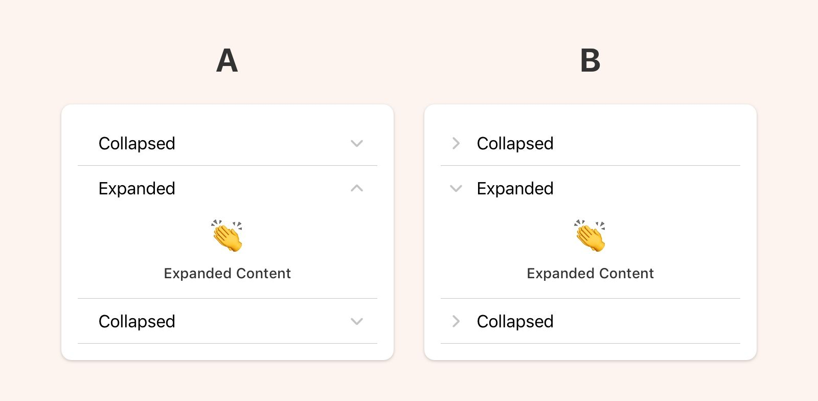
Understanding the environment you’re designing for is fundamental. What are the patterns and interactions users expect? If you design an iOS or Android app using only web design patterns, people will be frustrated.

The best way to understand platform conventions is to use that platform for an extended period of time. If you’re an iPhone user, try using an Android for a few months, and vice versa. Don’t let the Apple vs Google holy wars get in the way of doing great design work.

I’m aware that it’s not always feasible to acquire a second device, so here are a few other options for learning more about a software platform:

Performance Matters

This is not to say that performance doesn’t matter with web apps, but people’s expectations are different. On native platforms, people expect fast loading, smooth scrolling, and an overall snappy feel.

Your design decisions affect performance in positive and negative ways. Work closely with your development team to make sure your design doesn’t compromise performance. If it does, change your design.

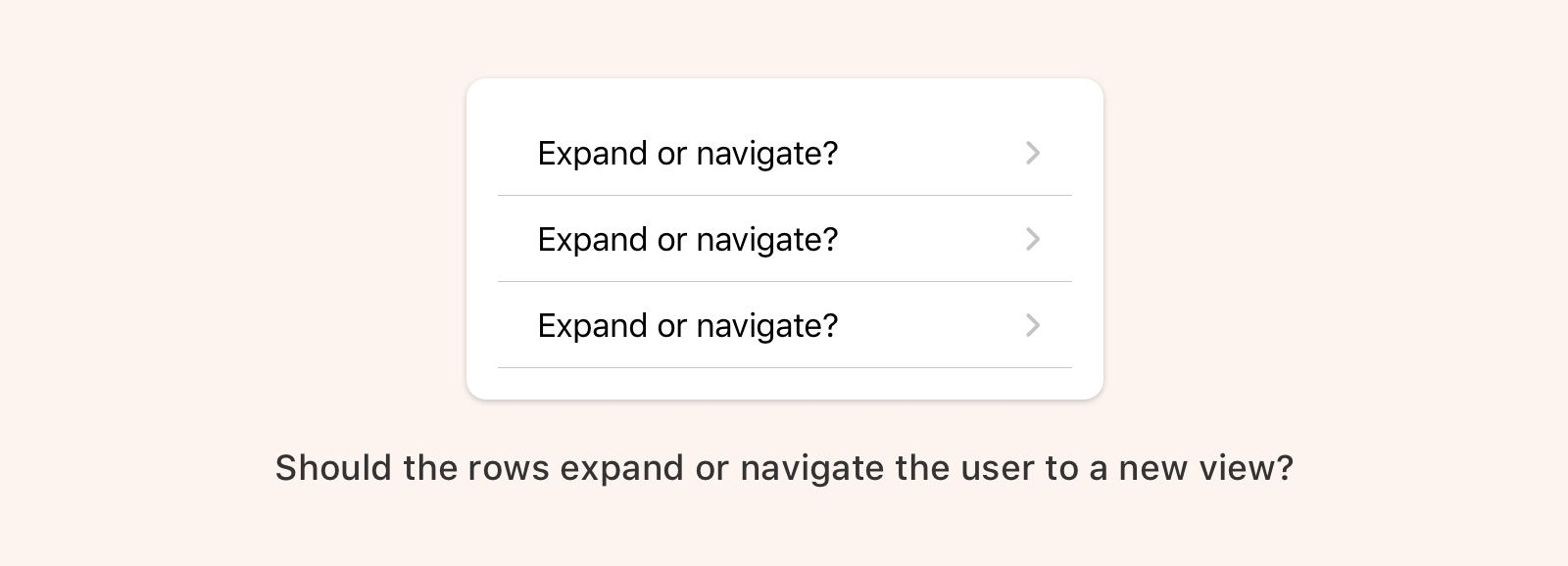
Your UI doesn’t have to be the same for every platform

Over the past few years, the design community has latched on to the idea that an app must look and function exactly the same for every single platform its on. The reason sounds something like this:

“If the UI is the same on every platform then our customers can easily jump from web, to iOS, to Android and not have to re-learn anything. This is a better user experience.”

The statement above is true if people only use your app. Sorry to break it to you but your app is probably not the center of people’s lives. That would be nice 😜.

Your app lives in the larger context of someone’s life. They are not thinking about your app as much as you are. They use it when needed and then move on.

In reality, people view their phones as a single experience. They may jump from app to app, but the way they see it they are just “using their phone”. Your app should fit nicely into that experience. Anything you do out of the ordinary will be noticed, and that’s not always good.

I think it’s more user-focused to use native patterns because it takes into account the totality of the user’s phone experience. They’ll understand the navigation structure because it’s similar to most of the other apps they use. They’ll know they can swipe to go back because every other app on their phone behaves the same way.

Not every app needs to, or should, surprise and delight. Most of the time people just want stuff that’s reliable and works well.

In Summary

Designing native apps is so much fun. Each platform has unique and powerful capabilities that are not available to web designers. Enjoy the experience of learning something new and don’t forget:

Go forth and design great native apps!

Avatar
Shawn Hickman Aug 26, 2019

This is a list of resources for design systems. Hopefully, it will be as helpful to you as it is to me. This will be updated as I come across more design system goodies.

System Examples

These are examples of design systems that I reference frequently. Either for their content, structure, or general design.

Articles

These are articles I’ve come across that have made me stop and think. I don’t necessarily agree with everything here, but this is all good stuff.

Creating a System

Managing a System

Selling Design Systems

Accessibility and Inclusion

Design Principles

Avatar
Shawn Hickman Aug 25, 2019

I’m looking at purchasing a Tom Bihn Synik 22. These are resources I’m collecting to help me decide if I should purchase. I’ll be updating this resource as I come across more info.

Written Reviews & Forum Discussions

Videos

Avatar
Shawn Hickman Jun 18, 2014

Let me start this off with this simple fact: I’m not a heavy Facebook user. Most of my digital time is spent in a href="http://twitter.com/poohbers">

It’s natural to compare Facebook’s flagship app and Paper, but I don’t see them as competitors. The flagship app is designed for a broad audience, and Paper is designed for a narrow one.

I took a backstage tour at Disney World a few years back, and something our guide said really stuck with me, “We try to tailor our experience to every type of person who comes to our parks.” On the surface it sounds simple, but think about how hard that is. People are so different from each other. They have different beliefs, tolerances, desires, expectations, etc. How do you design a single experience tailored to each of them? Maybe this is why we are seeing a big trend in the unbundling of apps. Once you gain a certain number of users, it becomes too difficult to keep them happy with a single experience. Hence, smaller focused apps aimed at making specific types of people happy.

This may sound obvious, but Facebook has a lot of users from all over the world. Can they design a single experience for a billion people and have them all be happy with it?

At this point you may be saying, “Yea yea, Shawn, but didn’t you see the numbers that Paper users only use it for x seconds per day/week/month?” Yes but I don’t care about that metric because it doesn’t tell me anything. It doesn’t tell me if the person is happy, frustrated, busy, excited, or whatever other infinite senarios I could write. Metrics are good, but they tell you very little. As a designer, I would rather have a happy user that spends 10 seconds than a frustrated user that spends 10 minutes.

I don’t know what the future of Paper will be. Maybe Facebook will kill it if it doesn’t reach a certain number of users, or maybe they will continue making these small focused apps for a narrow audience. In the meantime, I’m enjoying Paper. It’s making me a happier Facebook user, even if it’s only for a few minutes a week.

Avatar
Shawn Hickman Mar 7, 2011

Currently, when I get a text or push notification on my iPhone, it interrupts whatever I’m doing and shows me a dialog box that I must interact with. It’s insanely annoying.

After thinking about how it could be implemented on the iPhone, I think I have come up with something that solves this problem.​​

Here are some additional thoughts about my decisions:

This got a nice writeup on a href="http://techcrunch.com/2011/03/07/iphone-notification-system/">