Shawn Hickman Sep 9, 2023
Who’s ready for a long video about the apps, tools, and processes I use for developing Sofa?
Perfect for your weekend morning coffee time ☕️
Who’s ready for a long video about the apps, tools, and processes I use for developing Sofa?
Perfect for your weekend morning coffee time ☕️
My video this week is a little messy, but I think it shows how this past week was for me…messy. Working through my board games data provider going away has been stressful, but in the end I think Sofa is going to be a more resilient app because of it.
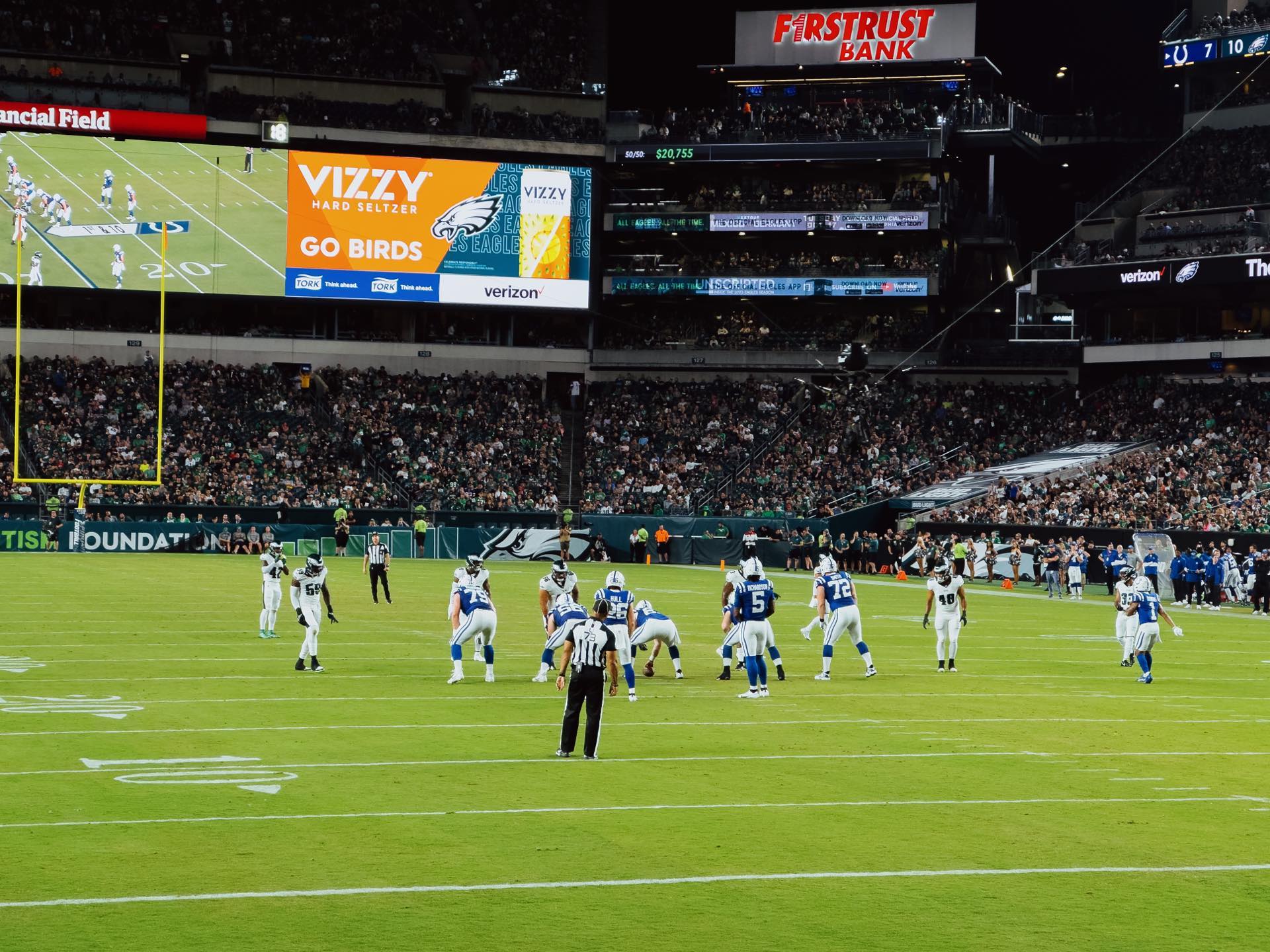
I kinda forgot that the iPhone 14 Pro can shoot raw and I got to use it last night at the eagles game. I’m extremely impressed.
This is using the 3x lens (77mm) from 3 rows from the field. Yes, the seats were dope.
I just finished up my first week as a full-time indie app developer and documented a bit of my experience.
I go over my goals for the first week, what I worked on, and some general observations about what my experience was like.
There’s def good and weird things about it 🙃
July was a busy and stressful month for me. I was working a lot behind-the-scenes to prep for quitting my day job to focus on Sofa full-time. Focusing on Sofa full-time has been eight years in the making. As I’m typing this out, it still hasn’t fully hit me that I’m actually doing it 🙃.
Sofa has grown a lot over the past eight years, especially in the last two. To say I’m excited is an understatement. Being able to work on something I love is a true dream and I’ll be working hard to keep that dream going.
I’ve you’re interested in hearing more, I made a video about it.
I’m continuing to work through this feature and I’ve made a little preview video to show how it’s shaping up.
I’m continuing to invest my time in YouTube. I find it a great place to share my thoughts and updates on my work in a visual way. If you missed them, here’s some videos I made over the past month:
Sharing a little preview of a cool feature coming to Sofa: the ability to addem>
Threads has been a lot of fun so far and it’s made something “click” for me with how I want to use social media going forward.
Spoiler: I just want social media to be fun 🕺
This is my favorite view of the castle in Magic Kingdom taken with my favorite lens: Sony 35mm 1.8. I’m ready for another Disney trip 🏰

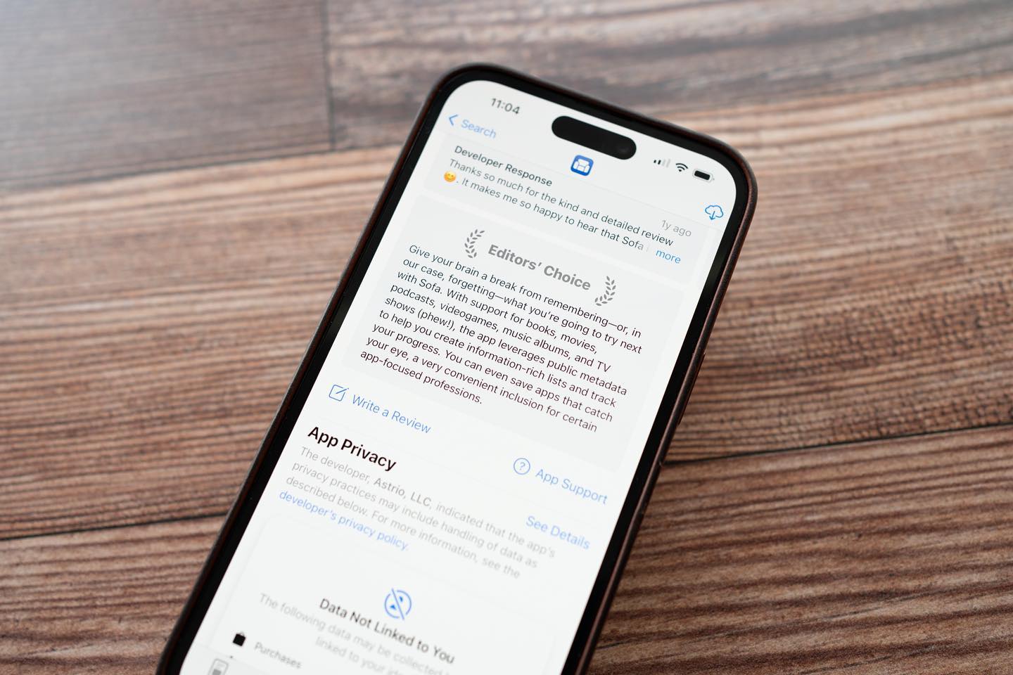
I don’t know when this happened, but Sofa has an Editors’ Choice badge in the App Store 🤯. Completely wild to see something like this.
If you’re an iOS or Mac developer, you may be asking yourself if you should spend time building for visionOS and Vision Pro.
While I can’t tell you want to do, I wanted to share how I’m thinking about this for myself and Sofa.
June was a busy month for me. Apple’s WWDC was the first week of June and it broughtem>
Some other updates I shared:
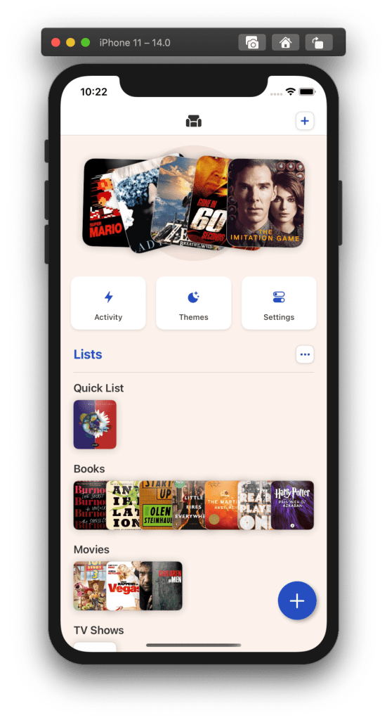
I’ve started working on a few new Sofa features that I've been prepping for a while.
First, the ability to addstrong>
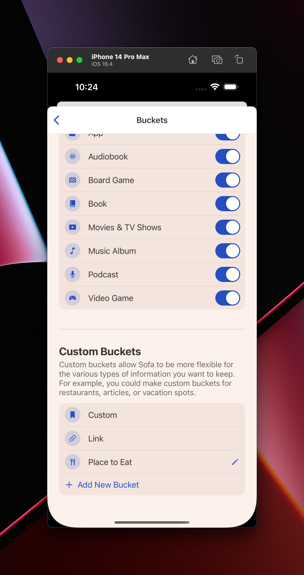
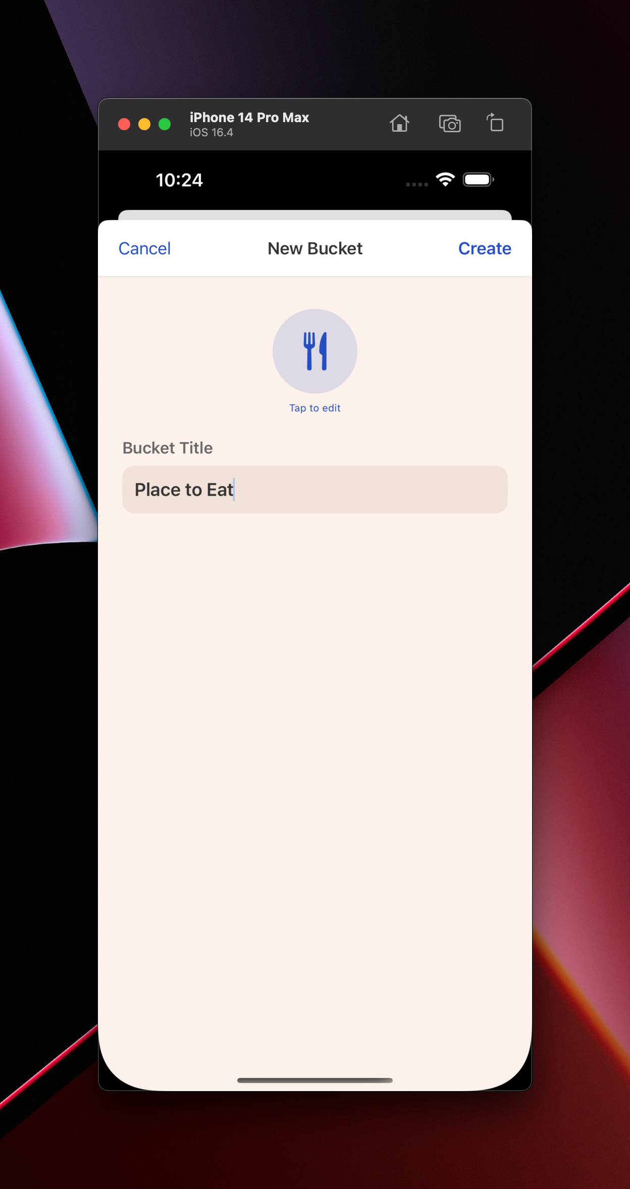
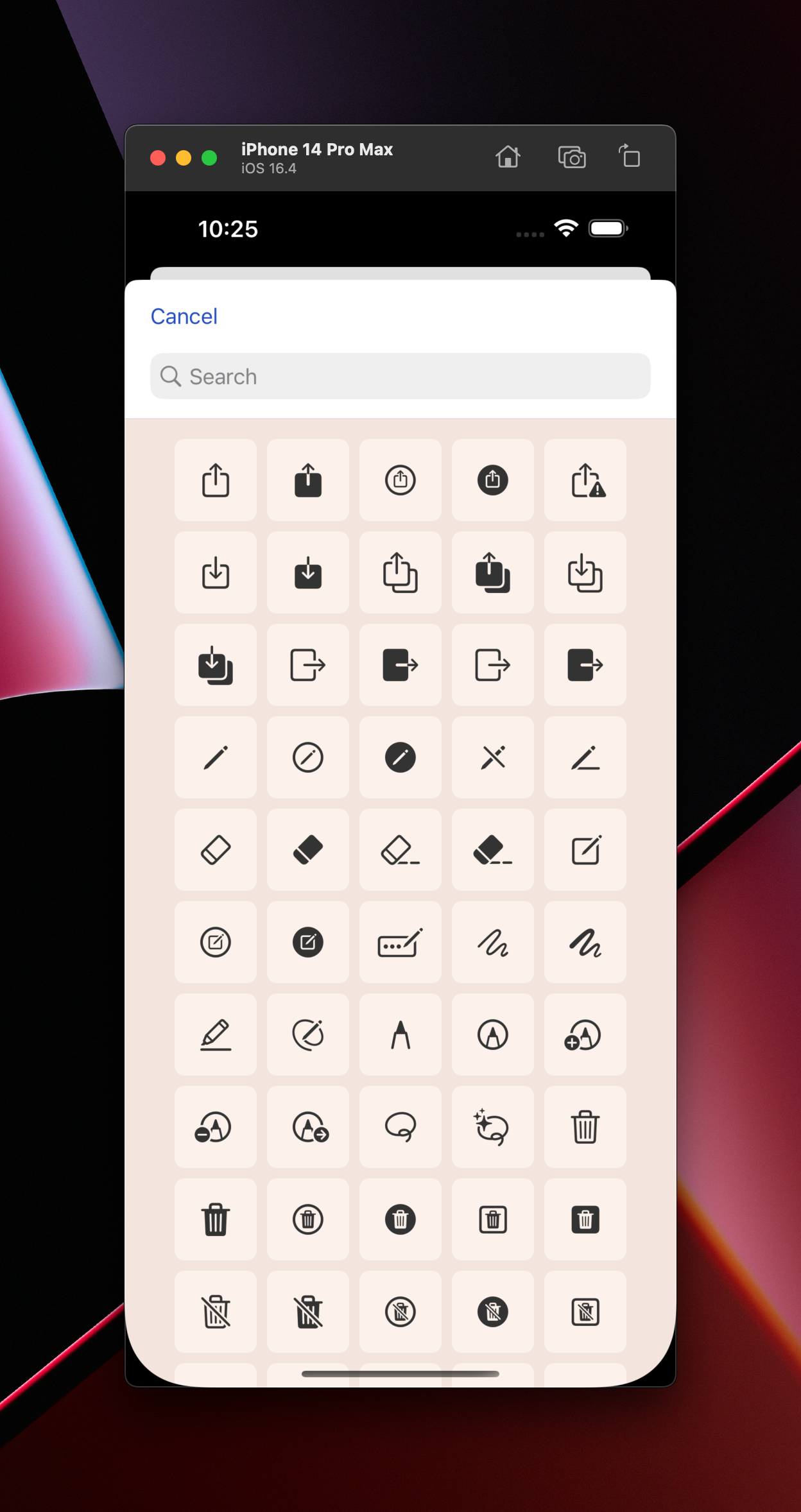
The second part of this feature is something I'm callingstrong>
Anyways, Buckets come in two forms:
em>
em>
I still have a lot to build, but this is a big part of making the app more flexible for people.
Links, custom content, and Buckets are intended to fill the gap when there isn't a reliable data source for me to add to the app for different types of content.
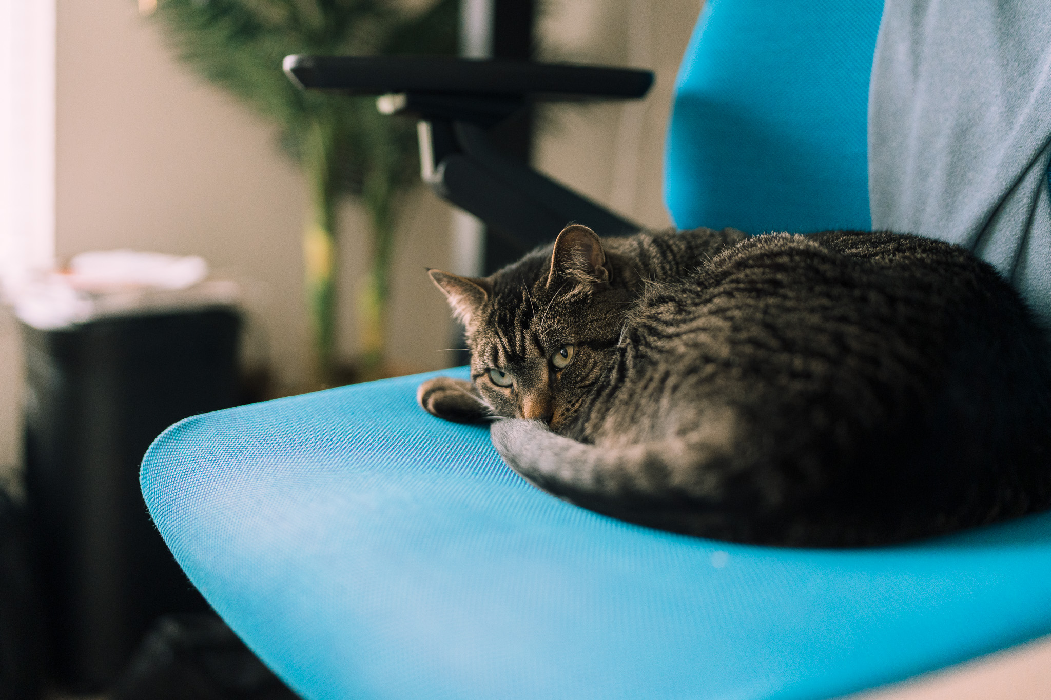
Monica loves to steal my chair when I get up for a snack or bathroom break. I then have to decide if I’m going to stand for a few hours or move her. I usually end up standing for a few hours 😜.
Thanks for reading Work Log! Subscribe for free to receive new posts and support my work.
Hey gang 👋, I’m finishing up some much needed downtime after almost of year straight of grinding out a bunch of big Sofa updates. I also need to rest up because a href="https://developer.apple.com/wwdc23/?utm_source=sofa&utm_medium=email">
Back in December of 2022, I released a huge update that brought shared lists, better shortcuts support, streaming providers for movies and tv shows, and lock screen widgets. a href="https://www.sofahq.com/blog/shared-lists-shortcuts-and-more/?utm_source=sofa&utm_medium=email">
I followed that big release up with a string of smaller, quality-of-life updates. These updates focused on plenty of little features, enhancements, and bug fixes. a href="https://www.sofahq.com/blog/sofa-342---quality-of-life-update/?utm_source=sofa&utm_medium=email">
Lastly, I’ve made some changes to Sofa’s pricing to make things simpler and more inclusive. a href="https://www.sofahq.com/blog/a-simpler-more-inclusive-subscription-plan-for-everyone/?utm_source=sofa&utm_medium=email">
Thanks for reading, subscribing, and your general support! Talk soon 👋
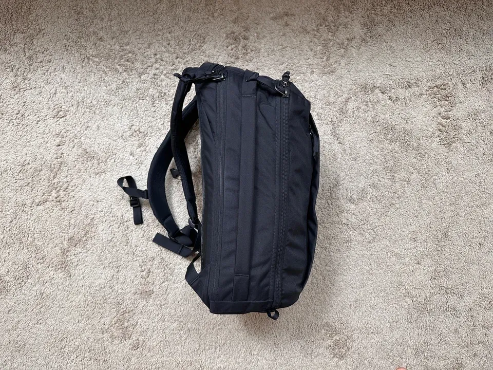
This was a href="https://www.reddit.com/r/EVERGOODS/comments/13bardo/packing_comparison_for_the_cpl24_and_ctb26/">
I just got my CTB26 last week, and since I recently took a weekend trip to Chicago I thought it might be helpful for people to see how I packed things out in my CPL24.
For context, I only brought the CPL24 on the trip. I normally travel with a backpack and wheeled suitcase (carry-on), but wanted to keep things light for this trip.
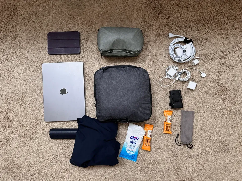
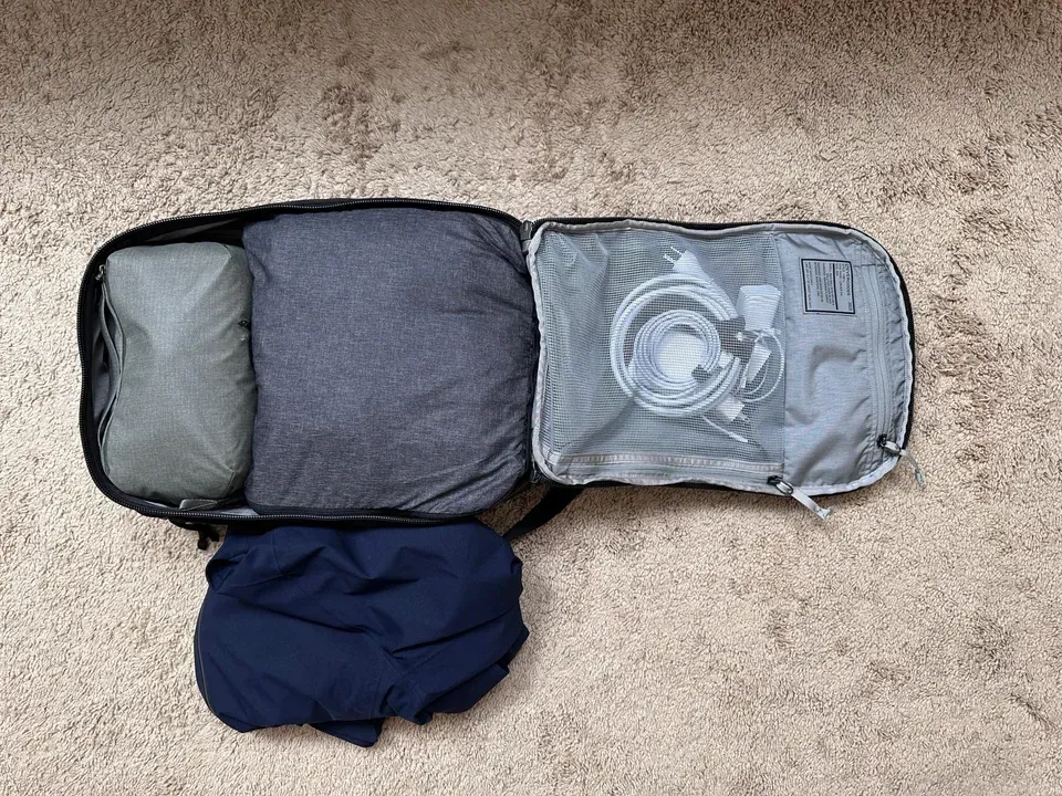
What I packed for a 3 day trip to Chicago
Things I packed:
The pictures show what I packed and how it all fit, but here’s some strong>
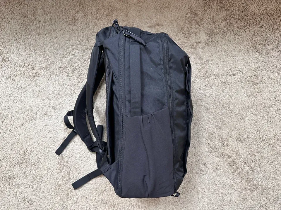
I haven’t actually used the CTB26 yet, but here’s some first impressions:
I’m likely going to be selling the CPL24 since I don’t see myself using both. The CTB26 seems like a hit to me. Gives me the same great experience of the CPL24, but a little more space a functionality for travel (which was my main use for the CPL24).
Notion is creeping into my life more and more, and one helpful little database I made is to track my PTO and the number of days I’ve taken or plan to take. I know the company tracks this, but checking Notion is much faster for me.
Here’s the formula to use to calculate the number of days off. It accounts for weekends and week days. I got it from this post.
I was recently interviewed on the Launched podcast with Charlie Chapman about Sofa’s origin story and how things work behind the scenes. If you’re interested, give it a listen!
In software, consistency and cohesion tend to get lumped together as the same thing. I’ve found this leads to painfully tedious arguments around product and design decisions.
strong>
For example, in an app, a primary button may always be blue. This consistency is good. It communicates to people that anytime they see a blue button, an important action is about to take place.
strong>
For example, let’s use an onboarding flow for a person using a product for the first time. The combination of front-end UI, backend infrastructure, workflows, product strategy, marketing, and customer support working well together creates a cohesive experience. If any one of these parts is inconsistent, it takes away from the cohesion of the experience.
Consistency enables a cohesive experience, but consistency alone is not enough. Aim for cohesion.
I recently released a href="https://www.sofahq.com/blog/sofas-ios-14-update">
99% of the views in Sofa were table views. Seeing the writing on the wall, I wanted to start tackling this right away. My path, though, wasn’t clear. Should I stick with UIKit and replace my table views with collection views or go in the SwiftUI direction? Either way, I had to learn new APIs so I decided to take time to experiment.
Since SwiftUI is the future of Apple development, I initially chose this path. I wanted to time-box my efforts for a few weeks in case things didn’t work out.
I started building out the main parts of the app like Home and Lists. It was slow at first but quickly sped up once I got more comfortable. I hit snags with theming and search but was able to hack around those by diving into UIKit when necessary.
After a few weeks, I was making and seeing good progress. This was so encouraging that I decided to go all-in and rewrite the entire app in SwiftUI. For those of you with sense, you’ll see where this is headed 🙃.
After a few more weeks things started to get dicey. I was a href="https://twitter.com/poohbers/status/1291057804988514306?s=21">
Around late August I decided I needed to abandon SwiftUI for now and jump back into UIKit. Instantly, my performance issues were gone and things were feeling smooth and snappy. Phew!
The downside was I had a steep learning curve ahead of me. Having to learn code>
Again, up to this point, Sofa was driven by code>
Luckily the internet is amazing and I was able to piece together a solution by learning how to create a view model driven by code>
If there’s interest, I’m happy to write in more detail about the solution I went with. All I’ll say for now is that this setup works great. code>
No way! I had to learn it to make widgets anyway and it had a couple of other benefits.
Since Combine is baked into SwiftUI with things like code>
I experimented a lot with the new design and features in Sofa 2.12. Once I had my footing with SwiftUI, creating views was not only fast but super fun. I was able to explore a bunch of ideas, with em>
I have so much gratitude for people who take the time to share their hard-won knowledge. Not only do they fill important gaps in Apple’s documentation, but they explain in ways that newbies like me can understand. Thank you!
These links helped me ship:
The detour was worth it, even if I had to double back more than I originally anticipated. The app is in a much more reliable and modern place than it was six months ago. Bonus, I got to learn more stuff!
My plan going forward is to stick with UIKit for the core parts of the app and sprinkle in SwiftUI where it makes sense.
If you want to see the fruits of my labor, you can a href="https://itunes.apple.com/app/id1276554886">
This is a webinar I did with Amanda Kalk back in the spring for a href="https://www.thinkcompany.com/">
When it comes to implementing a design system, success is an eternally moving target. Evolution and maintenance are critical over time, but how do you recognize the catalysts and symptoms that mean your system might be failing? Join us for a deeper dive into why your design system might not be working the way you expected—plus what you can do about it.
I was interviewed for the Creators Campfire podcast the other day and had a great time. We chatted about Sofa, app development, and more.